Welcome to my Blog.

Translate my Posts easily.

Welcome to my blog.

I'll be posting thoughts, photos, happenings, and other art
related information from time to time.


If English is not your most comfortable language please use
the Google translator on the right for fast translation of my Posts.

Thank you.
Visualizzazione post con etichetta techniques. Mostra tutti i post

martedì 24 marzo 2015

RED. . .Almost One Year.

Connections - Red 5    oil, wax on panel    50x50cm 
Almost a year has gone by since I decided to limit my palette with red as dominant color. (blog post "Red- - -Who's afraid ...") I started out very hesitant. Inspired by the force and brilliance of the color itself, I was still intimidated. By combining it with  black I intended to soften any harshness but that was silly as you can well imagine. That was the beginning.

Now that I am on my fifth painting with red as protagonist I'm feeling happily at ease, in fact, liking the choice. I've learned so much.  I can thank, (never enough), Janice Mason Steeves for her counseling: to play, to accept challenges, to simplify, to be aware of contrast, . . . . .

I don't have a general plan for the sequence of my paintings. I used to do drawings as preparation but now, one after the other, I rely on intuition.  One painting is naturally the stepping stone for the next.  Something just clicks in my mind inspiring the sequence. I've noticed in the recent paintings the appearence of new colors. From the begining using mostly red and black, now lights, yellows, oranges and greys, are  presenting themselves. A sign that red has become a part of me and not a fearsome, intrusive element?

My theme is always the human body, the spinal column in particular.  My next project, constantly on my mind, is to be able to put into words why this particular part of the body is so important for me.

martedì 26 agosto 2014

Finishing Up . . .

   There is little difference between the first and the final draft of my new painting. . . just did a little "cleaning" up and toning down where I felt it was needed.                          

"Connections"
oil and mixed media on canvas.  50x70cm 
final version

This canvas was first prepared with a base of gesso and stucco to give texture  and relief to the surface.
I continued using broad spatulas and large brush stokes to create  color fields and to blend colors one  into the other.
As always, my interest is in the anatomy of the human body, the internal anatomy, and, in this case specifically,  the spinal column.

martedì 29 luglio 2014

Redoing, Moving On. . ..

Connections - Red   50x70 cm   oil, cold wax on paper mounted on panel


This is the first of the two panels I have been working on as I put my new studio space in order.

 During the first stages of my moving days, I only had time to keep looking at it, trying to analize what was bothering me in this painting. (see last intervention in post: Red. . .who's afraid. . .). Then it slowly came to me. It lacked an important ingredient,  contrast . . .and, clarity.  I'm afraid I get so wrapped up in colors while I paint that I lose interest in the image.


Connections -  Blue   50x70cm  oil, cold wax on paper mounted on  panel
 
 This is the other painting that I worked on.  Again I wasn't happy with it (  see earlier version in post: Digesting my paintings and moving on)). The same problem,  I was too interested in color and  not occupying myself with the forms and contrast.

 I stopped here with redoing because the transformation is an entirely new painting.  And that is what I'm about to do. . . a new painting. This time I'll try to remember eveything the first time around!!!!!!


sabato 31 maggio 2014

RED . . . Who's Afraid of the Big, Bad R. . .

Connections   oil on paper applied to wooden panel   50x70cm
Something new!

I have always avoided reds, don't know why, or rather I  do know why . . . too strong, too dominant, too . . too everything I guess. I considered them  too difficult to handle.

But here I deliberately chose red, alizarin crimson red to be exact, ( with touches of cad. red to warm up a little). After my sessions of mentoring with Janice Mason Steeves, I now feel I can defy my self-made taboos and restraints without consequences. It is completely liberating .  I enjoyed working on this piece, a real challenge and intend to continue with reds and new color schemes from here on.

Not only my color choice was liberated but so also was my method.  Again thank you Janice. I began with very thin washes of color (color, oil and turpetine) and watched as they dripped and intermingled down the paper as if they were watercolors. Remembering the importance of tonal contrasts I kept track of the lights and darks as I constructed my composition. Brushes were put aside in favor of spatulas, palette knives and . . . my fingers, also in line with the neccessity to "play" with my paint, to feel it glide onto the support, (which is paper, prepared with gesso and applied to a wood panel.

Again I am continuing my theme of anatomy using the spinal column as the central "figure"!

Just want to show you another "red" painting done awhile ago. There's a difference???? A change?
 
Figures -  oil, cold wax on canvas,  64x47cm


Thank you for visiting.


martedì 25 marzo 2014

Playing . . .the Game of Painting


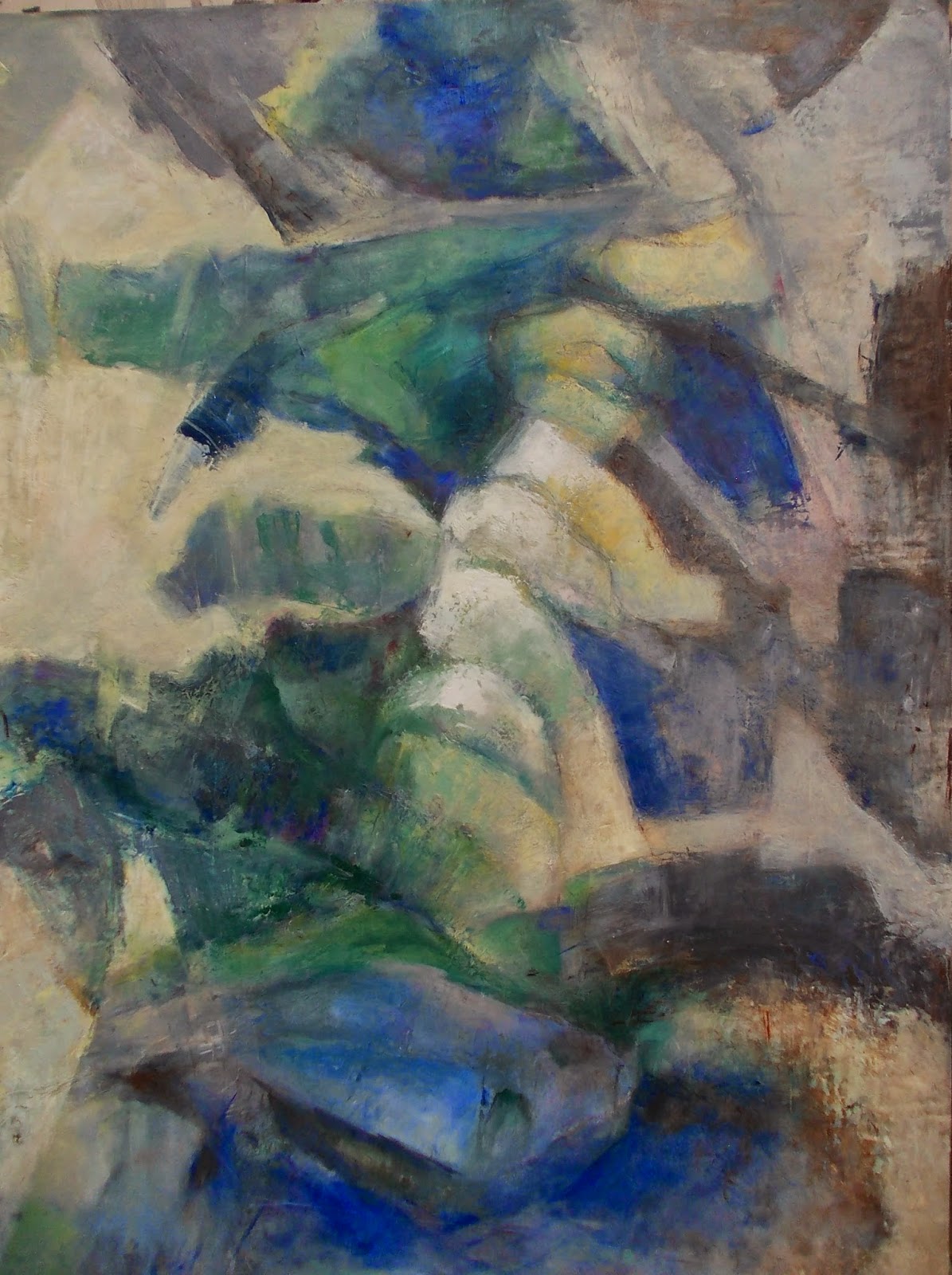
Connections    50x70cm        oil on paper


I have finished the last  painting that I will be presenting to my mentor, Janice Mason Steeves, in a few days.  This time, I can really say that I experienced the "fun" in painting  that Janice has always said is a must.  That loosening up that eliminates any tension, any self created fears of making "mistakes". janicemasonsteeves.art blog.

First, I layed in my lights and darks using an idea from the value studies done previously for Janice. I decided to use a limited palette of blues, yellows, greens and black. My brushes were large as were my spatulas.  I didn't want to fall into the temptation of creating small details and minute forms so LARGE painting instruments were best.

As usual, my forms are  internal anatomical shapes  but this time, once they were in position  in the overall  design, I began to have fun distroying them. At first I used a large, homemade bamboo pen that I made years ago and "drew" into the wet paint breaking up the solidity of the forms. Then, using only my spatula, I built up the negative space around my forms with thick layers of paint concentrating on lights and darks, forms and movement. Again, I wanted to lighten the forms by breaking into them so I chose to use a brayer which picked up  and deposited color  creating movement and light within the forms.  I scraped and rubbed away the color. Nothing was "sacred".  Nothing untouchable.

What I wanted to achieve was a less formulated composition, to express the strength that is an essential part of these forms without making the whole too heavy.

I was in a rush to begin working for my fourth and final session with Janice but I wanted to work on a panel, not canvas.  I  had to wait too long for the delivery of the ordered  panels so decided to work on paper.  I sized the paper with gesso, pinned it to my painting panel and began.  Maybe the use of  paper gave me the strength to mess around, to "distroy" and to go ahead again.


These are the instruments I used. Spatulas, a brayer, my bamboo pen and . . . a Ferrari red spatula sent to me by Janice and "fun" to use.


Thank you for visiting. Hope you will leave a comment.

venerdì 7 marzo 2014

A Revolution is in Progress


quick schetch for new work 1


 A Revolution is in Progress . . .


 There is a revolution going on in my head . . . in my work.

 At this point  I am at my third session of the mentoring program that I am following with Janice Mason Steeves, amazingly talented abstract painter and teacher.

     see link below


    http://janicemasonsteevesartwork.blogspot.it/                                                                                       
                                                                                                

quick schetch for new work 2


These schetches  were part of a preparation exercise. Quick work, playing with color and forms, working on drafts of architectural drawings, done for Janice, my mentor, in preparation for my 3rd session. They were the basis for my next paintings, 50cm x 70cm, still in the finishing  process.

Still in the finishing process. . . what I thought was finished for the third conversation was only a "brutta copia" as they say in Italy and means a "rough draft".   I am working at making amends. . .!!!

THEN. . . after discussing my work, Janice gave me a new homework assignment.  I was to do small excercises in value.
Black and white value schetches looking for the solutions in design, balance, working only with black and white. This has worked wonders for me and is coupled with the notions of limits . . .simplicity . . . balance.


my value studies


These value studies were fun to work on and became, slowly, revelations for me. The forms can be strictly geometrical or anatomical as mine are. Each square can hold  7 forms (or less). They, in turn, will be divided into various values . . . from the highest, white, to the lowest, black.


sabato 8 febbraio 2014

5 LITTLE CANVASES TAKE ONE STEP FORWARD


I took each of these pieces one step forward in the sense that I edited them.. .  removing forms that weren't in harmony with the whole, enforcing contrast where necessary, enriching color fields for full
color  harmony, etc. . etc. (To see changes made refer to my last post) Remember that a finished canvas is never really finished unless the artist is satisfied with the end result. . .  and now I am.

I am now working on my next assignment for my mentor which is due on the 21st of this month.  Two canvases, 50x70cm, which I prepared myself,. . . . stretched and  primed the canvas . . . and have begun to paint.
(See you soon)

venerdì 24 gennaio 2014

....PASSED WITH FLYING COLORS.. . .

My second session with Janice Mason Steeve's mentoring program was even better than the first. I was  relaxed though eager to know her reaction to the images of my paintings. Judgement is always  terrifing.  But I made it! Got through the test with FLYING COLORS ( literally). WE talked about lots of things. . .  the time passed too quickly.  And now I have a new assignment.  Work in the same direction, using internal anatomical shapes along side architectural drawing, lines, etc. only BIGGER. Can't wait to start......

But first I would like to show you what's been going on with me doing those first 5 canvases.

Connections 1: oil on canvas -  30x30 cm - 12x12 inches  (The pic doesn't do justice to the varied yellows that are there!)

Although I worked on all five paintings at one time, there is always one that starts things  off and this is it. The canvases are 30x30 cm, small enough but when there are 5 to finish in a short time they can feel very LARGE. I used a limited palette, yellow ocher, cadmium yellow, alizarin crimson, cad. red, mineral violet, ultramarine  blue, burnt umber, white. Too many colors are confusioning.

This first piece depicts internal anatomical shapes referring to the head. The straight white lines suggest the structural parts, the architectural drawing, the bones.  I had intended to include written parts, formulas, equations, etc., but decided to eliminate these following Janice's thoughts about limitation, simplification.

Now I am working  on a title. Something that will embrace all 5 pieces, the series. 
I will post others tomorrow.


martedì 21 gennaio 2014

HOMEWORK FINISHED ! ! !

Preperatory sketches for my new project
While I waited for the holidays to end and to begin the new project with my mentor, I did some preliminary sketches to get me into the idea of what to do. Fast drawings, doodles really, that I wasn't necessarily faithful to. My homework assignment was to focus on an idea,  to choose a medium and a style that would then become a Series of 5 related paintings.

I chose to continue my theme of the human figure, its internal shapes, in combination with technical and architectural drawings. I strongly feel that the figure and architecture are inter-connected. We dwell within archtectural structures  giving them life and breath. We are in symbiosis.

I put my canvases on a flat surface where I could easily move around them and work on each simultaniously. My idea was also to hang them vertically but not in one direct line.  They would be off-center. Therefore, each canvas has straight lines (architectural) that intersect the image (anatomical) but only one of these lines is directly connected to the canvas below which is off center.


This is the scheme for the order of the 5 canvases


The next session with my mentor is on Thursday, the day after tomorrow.  I am anxious to talk to her and hear her comments on my work which I will then post!


martedì 24 dicembre 2013

Wishes for a very happy Christmas!

Sorry if I've been absent of late. But I have been working and I wanted to send my wishes to all for a very happy Christmas with this card.  I finished printing just last week after putting the finishing touches on the etching. You may remember this from a previous post (The First Print - 8/8/12) but I took it a few steps forward by reinforcing the darks and bringing out the lights.  Much more contrast now.

STEPS IN PRINTING:

1.wetting the paper
2. removing excess water

3. preparing the ink
4. cleaning the plate before inking
5.registering the plate on a dummy
These are the fundamental steps neccessary before a print is pulled.
 The final print is then dried flat between absorbant cardboard and protected with a small piece of tissue paper so that the wet ink doesn't smudge.


domenica 6 ottobre 2013

Reasons Why. . . Why Print . . .Mono. . .?


 Reasons why I like to print . . . mono . . . .?
 
monotype-2000
   Many I suppose . . . mostly because it is spontaneous, unpredictable, quick to execute, . . . not a tragedy to destroy if unsuccesful but easily retouched to correct errors or add details if need be. And. . . because there are so many-many solutions. So many-many experimental approaches possible. So many surprises depending on the paper used, the viscosity of the ink, etc.etc.  and, did you know that Degas as well as Toulouse-Lautrec, Gauguin, Klee, etc. . .  and, of course, Picasso were masters of the monotype? Just to name a few and not even mentioning contemporary artists. Interesting to see their work and to follow their example.

 And. . .
 printing
is good for the moments of transition in my painting.  I'm enjoying these printing days.  I'm enjoying the feedom it gives me. And, I'll probably continue for awhile.


What's up in the courtyard greenhouse?


 As of Friday, October 4th,
my strelizia flower looked like
this. . .. . . . .. .  . . .slow but steady . . . .. .

mercoledì 25 settembre 2013

Print #3 and the Strelizia Saga

inked plate ready for printing


 Print #3 - (plate)
 the plate was inked with etching inks
      cleaned with gauze in various areas
                 and on all four edges.


print #3


strelizia flower forming


Print # 3 -

 Note how much of the ink printed is a
 pastel.  This is because I "cut" the
 color with a transparent ink not white.


The Strelizia Saga . . . . .

This is today's picture of my flower to be. You can see now how it's forming at the top. Thank goodness the weather is holding out. It is still warm and sunny in Florence but the evenings are cool.


lunedì 23 settembre 2013

A Series. . . Monoprints

basic plate with tape
 I was very meticulous this morning about my printing - again using the basic taped plate #2. I dampened more paper. . . mixed my colors. . . and  began to paint on the plate, adding and removing color until my image was ready. I carefully covered all four edges  of the plexiglas with clean masking  tape to protect and to keep the edges clean. This tape will be removed just before I print maintaining the plate as clean as possible.

I removed the masking tape . . .   placed the plate on the register . . carefully positioned my dampened paper over the plate and register . . . and  then proceeded to run all under the roller of my press.

Below is  final print #2 , using etching ink thinned with linseed oil. There is no similarity between the image shown in the previous post using the same plate. This can happen.  The pressure was very light on the first printing  therefore the image was very uniform and light. I used wax pastel to accentuate some details after the print was dry.

final print #2

 This is a completly different image (above) although I used the same plate. Here the color was painted onto the plate with brushes following the lines of the tape.  To create lights and  to blend the colors I  partially removed some of the ink with gauze .

inked plate after printing.
The plate has almost totally lost its load of color.  I like this delicate image.  I could have tried to print this again but probably there wasn't enough ink left. It could be a stepping stone for tomorrow.

sabato 21 settembre 2013

New Monoprint and New Error


new monoprint
This is the print of the second plate where tapes of various widths and thicknesses are fixed to the plate itself to add imagery and texture. Once it was inked the plate was run through my press. But I made another mistake. . . The pressure was not strong enough.  I was used to the thickness of the previous plate and "forgot"!!! to adjust my pressure. This is interesting, but the colors are not what I had intended.  Will try again on Monday with more color and more pressure.

lunedì 16 settembre 2013

Inking Plate Using Brushes and Printing Inks


Using the same plate, by changing  the way  the color is applied and the range of colors used, the images are similar. . . not exactly alike, but similar. The prints could be used as a series.


this time the  plate was prepared using brushes to apply printing ink


 the resulting print

mercoledì 11 settembre 2013

Monotype or Monoprint? What’s in a Name

plate 1
plate 1
plate 2
plate 2
I’ll be using these two plates for the next printing sessions. Note that they are both covered partially with masking tape to create texture as well as imagery and, because this tape will remain permanent, the prints will change their names.  What’s the difference?

Monotype vs Monoprint . .  .
A monotype is neither a print nor a painting but a combination of both. It is one image, painted or drawn  with various mediums, oil or water based, onto a clean plate.The image is then  transferred to paper. A monotype plate is unworked, has no scratching or carving on  its surface. It produces a single image and cannot be reprinted. My first prints were monotypes.
A monoprint is, however, a print made using a plate that has already been worked on either by etching, collage, or lithography. The image will still be one of a kind but there is greater possibility to create a series, an edition of similar images. My next prints will be monoprints because, as you see, the plates have been worked on with tape. The main image in each will be similar.
4th  monoprints 005  plate 1 (on the right above) inked before printing
4th  monoprints 006 the print